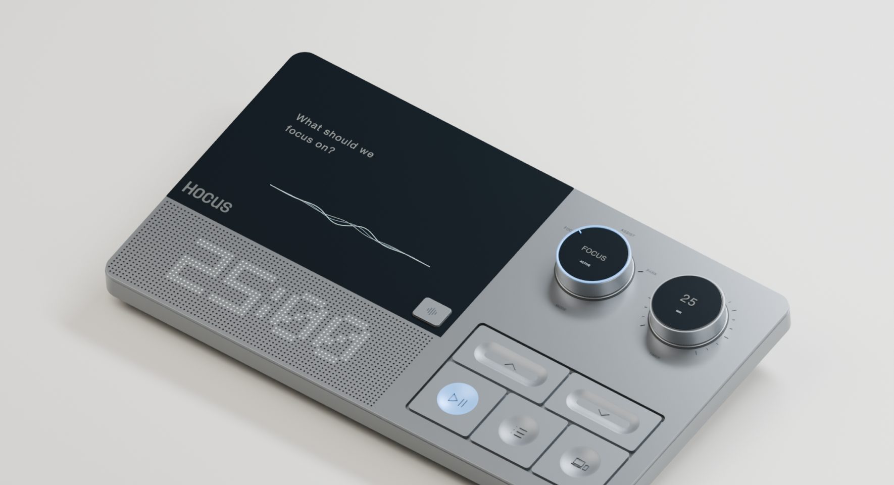
Hocus · Hardware × AI · Concept
A physical starting point for work that runs in parallel.
- The project
- A self-initiated concept exploring how a physical device can help people focus when work runs in parallel. Hocus is an AI desk companion that turns many open tasks into one clear next step, and makes starting it a physical action.
- My role
- Product designer across:
- Strategy
- Interaction
- Hardware form
- Screen UI
- Visual identity
- 3D concept
- Deliverables
- A 3D concept, the screen UI and a workflow demonstration.
Overview
With AI tools, more work now runs in parallel, as different tools handle different tasks at once. In this new way of working, it is easy to lose track of focus, and deciding what comes first matters more than ever.
The problem
For a fast-moving startup founder or a cross-functional freelancer, parallel work quickly becomes overwhelming. Attention splits across tools, agents and deadlines, focus slips at every switch, and tasks get started but not finished.

Where focus breaks down
- Before workOpen tasks sit across tools and in your head, so nothing feels clear.
- At the startWith everything urgent, choosing the first step takes longer than doing it.
- During workA new thought pulls you into another tool, and the task loses its thread.
- On returningAfter a switch, finding where you stopped costs time and momentum.
Scoping
How might someone move from many parallel tasks to one clear next action, without adding another thing to manage?
I started from the four moments where focus breaks down and weighed three common directions against them, looking for the one that would still help on a busy day of parallel work.
Directions considered
A smarter to-do list
Put aside
A list shows everything at once. It does not narrow the work to one next step.
AI picks what comes next
Put aside
AI can suggest, but the person should decide. A wrong pick costs more than no pick.
Blocking distracting apps
Put aside
Some switching is part of work. Blocking treats every switch as a failure.
Every direction still lived on the screen that pulls attention away, so each one competed with the distractions it was meant to solve. I wanted to explore how a new gen AI device could address this: a dedicated companion on the desk, separate from the screen, that only holds the next step.
Where else could the next step live?
| Surface | Stays in view | Starts by hand | Away from distractions | Can talk it through |
|---|---|---|---|---|
| Phone app | ||||
| Sticky notes or paper | ||||
| Smart speaker | ||||
| Desk object with a screen |
The solution
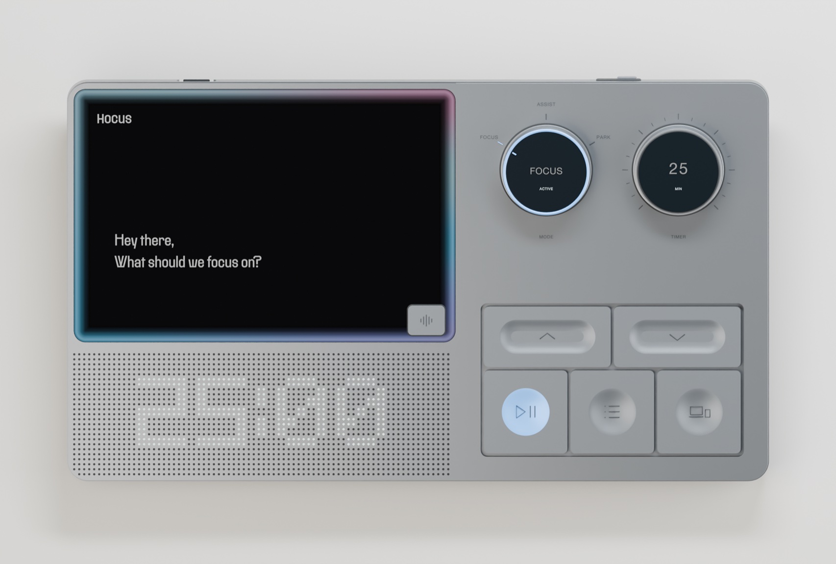
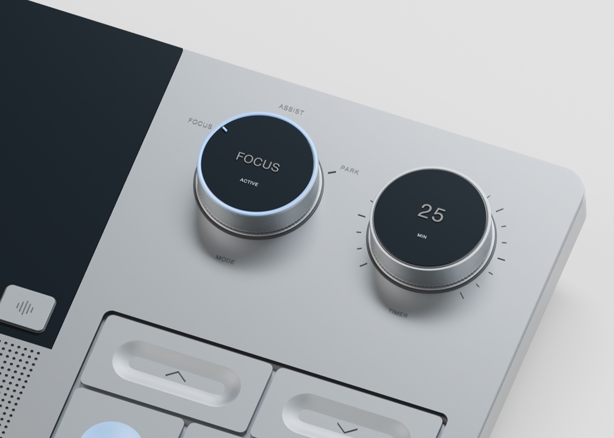
Meet Hocus: a compact desk companion to choose, start and return to work, with a desktop app holding everything behind it.
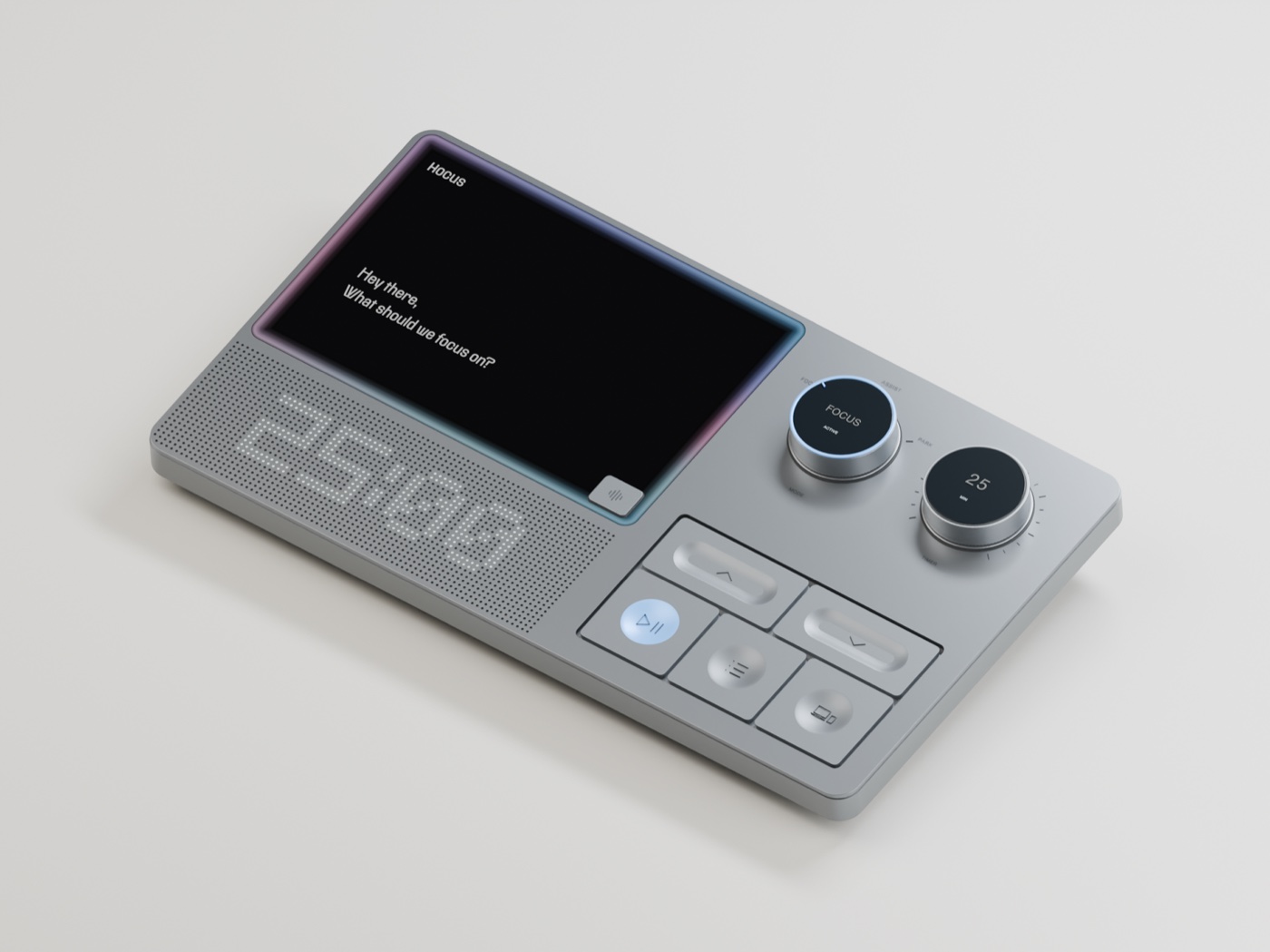
What the object needs
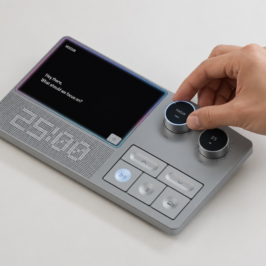
- A gesture, not a lockTurning the dial and pressing Start make the intention tangible.
- Next step in viewThe next action stays on the dock, outside your head.
- Always in reachA dedicated dial and button, not another app to open.
Core workflow
A freelancer moves between a proposal, background research and a client estimate, followed through four moments.
Workflow 1/4
Get the open loops out of your head.
Workflow 2/4
Make starting a physical action.
Workflow 3/4
Park the thought. Keep your focus.
Workflow 4/4
Assist asks before it answers.
Design decisions
What I chose to leave out, so Hocus stays focused on the move into work.
Policing the day
Blocking every app switch as a failure.
Help people switch on purpose, since some switching is part of work.
Less distraction enforcement
A separate Plan mode
A mode just for planning the day.
Focus, Assist and Park, with priorities set in context.
Not a full planning tool
A phone app
Controls on a second screen.
Setup and review on the desktop, everything else on the dock.
No phone controls at first
A productivity grade
One score for the day.
Progress shown as finished, advanced, parked or resumed.
Fewer simple scores
Refining the form
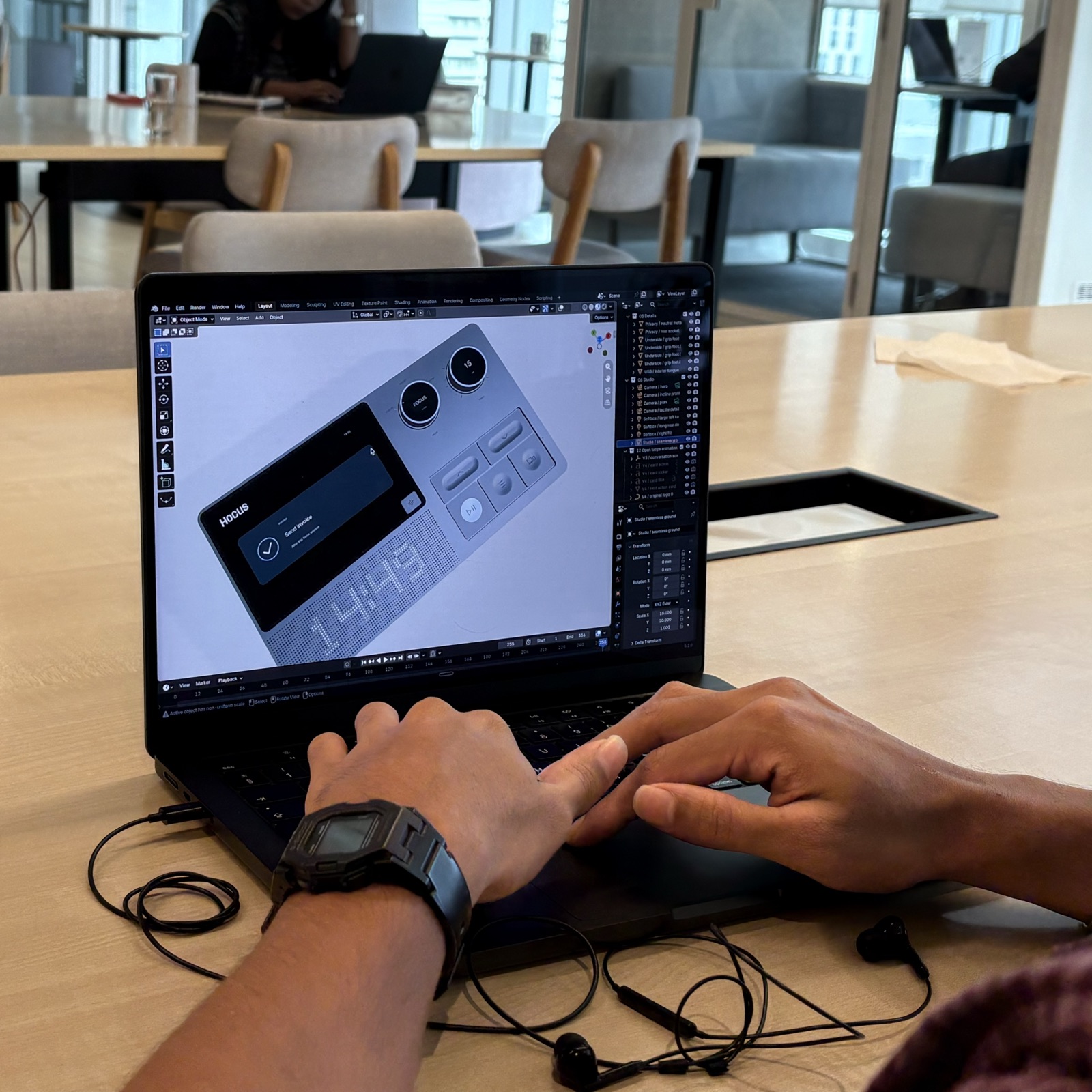
The hardware moved from a separate screen and controls to one surface: a compact, tactile companion, not another small computer.
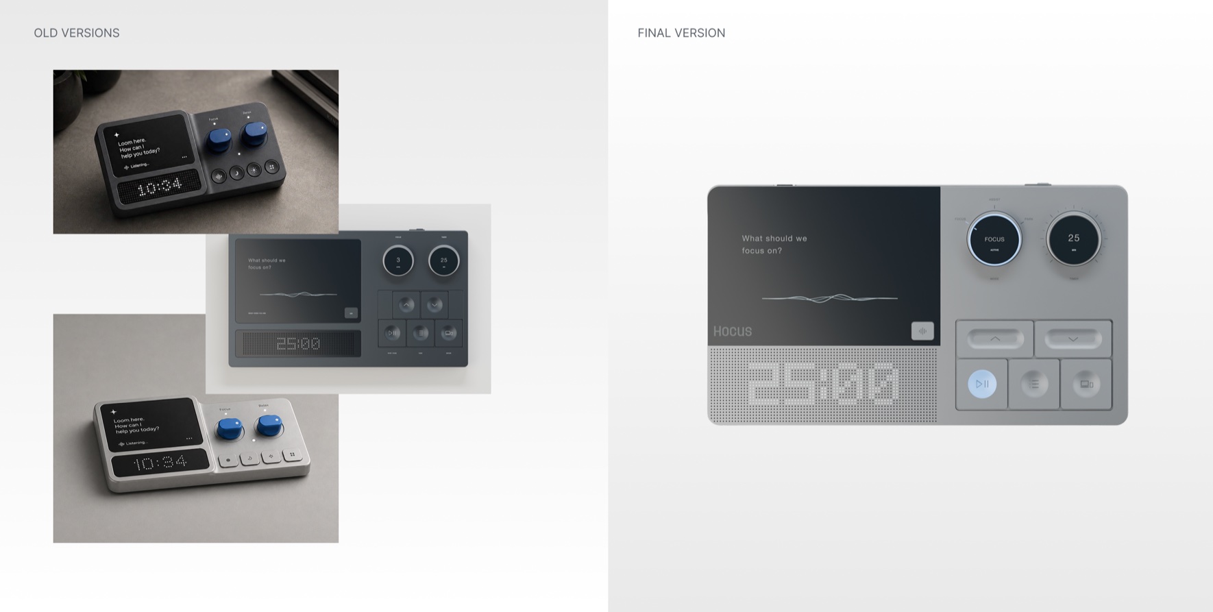
- Related radiiScreen, enclosure and controls share one geometric language.
- Clear hierarchySoft blue marks the mode dial and Start, the primary actions.
- Quiet feedbackA listening ring responds in conversation, and the dot matrix holds the timer.
Visual identity
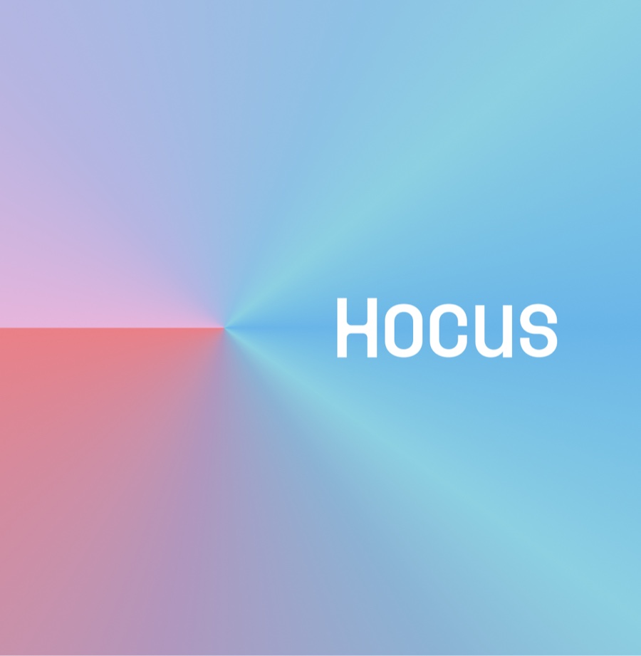
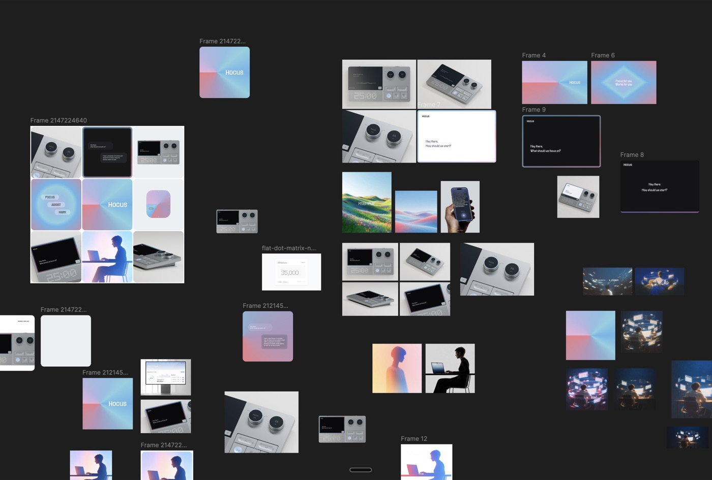
One gradient runs through the mark, the app icon and the interface. The hardware stays grey so the colour lands.
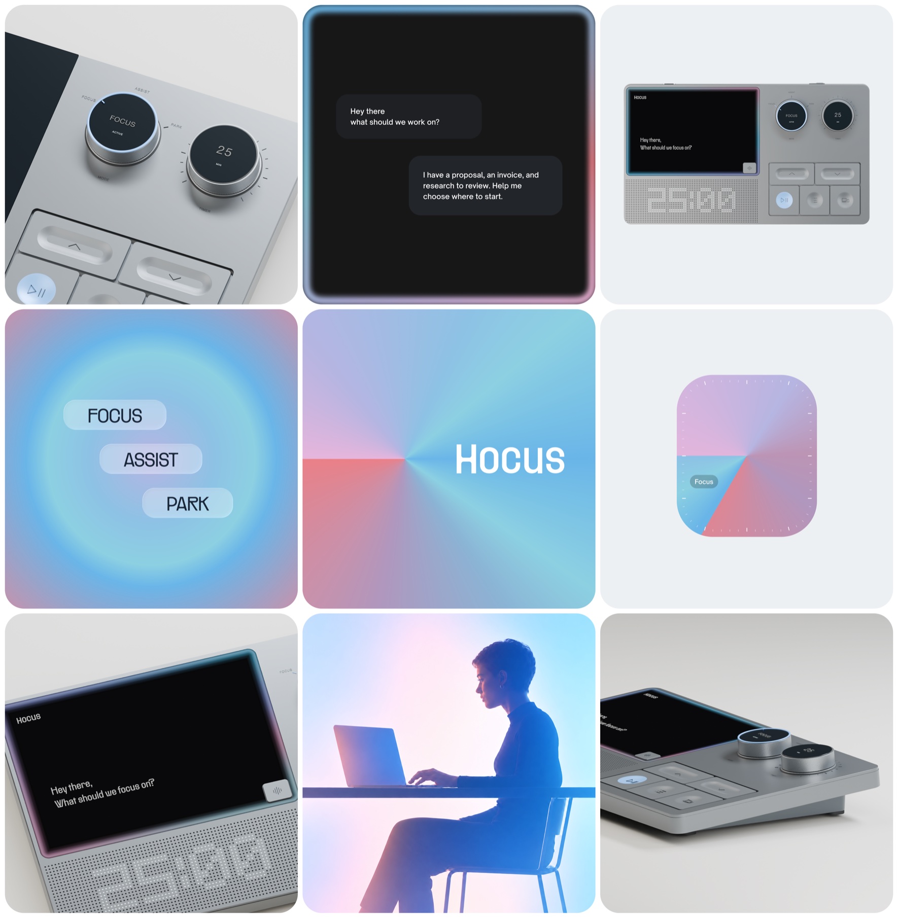
The dashboard
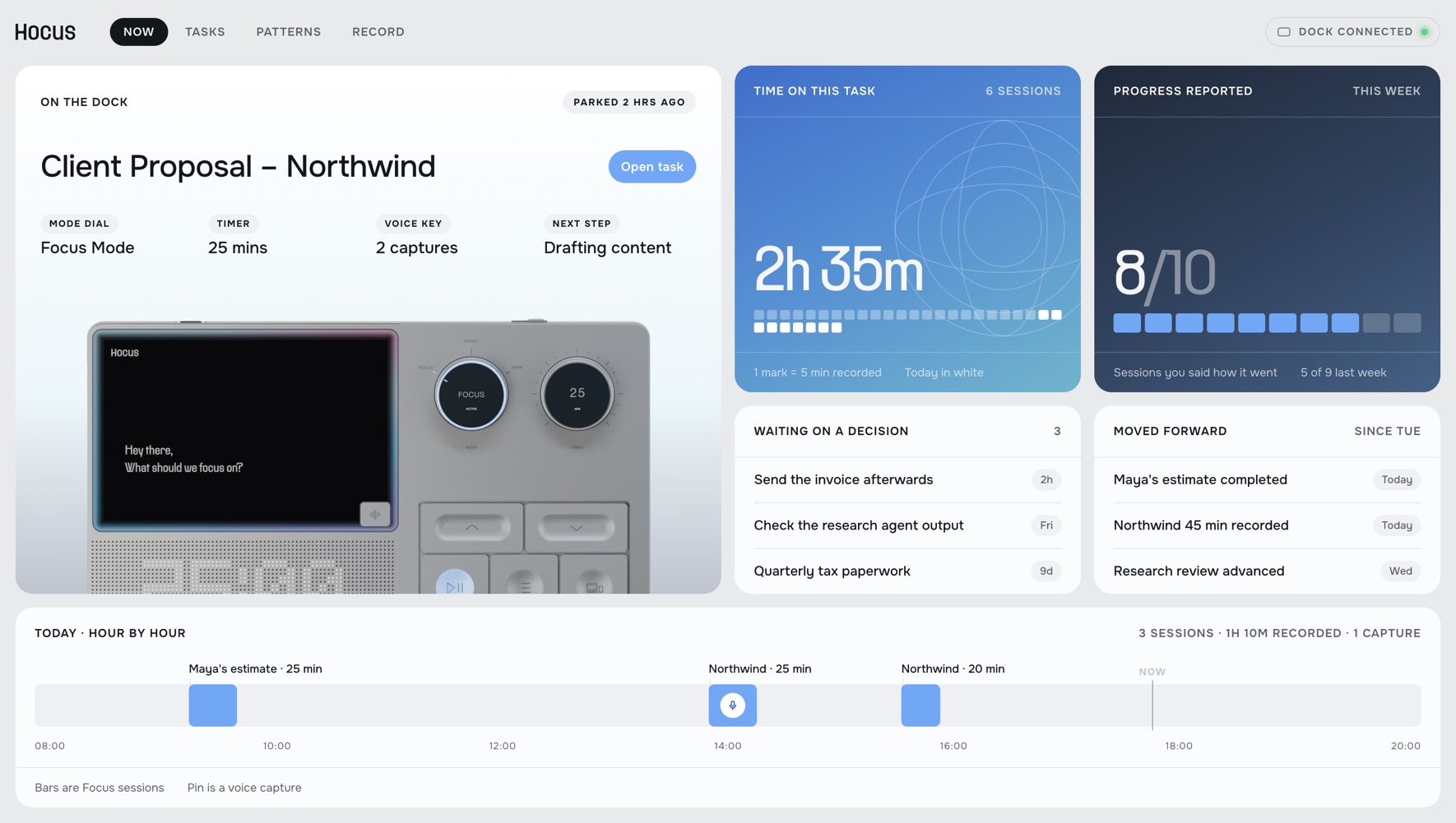
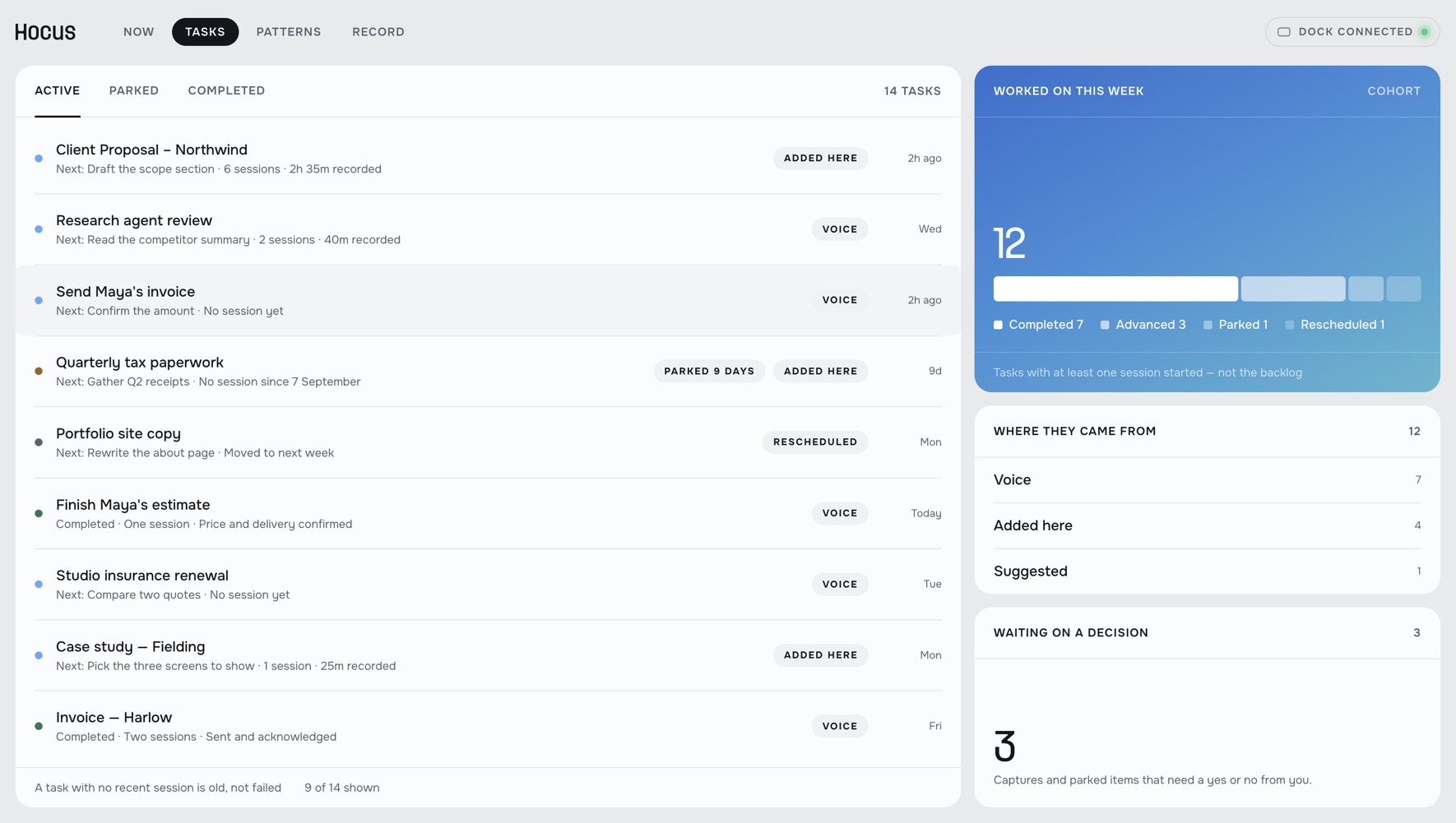
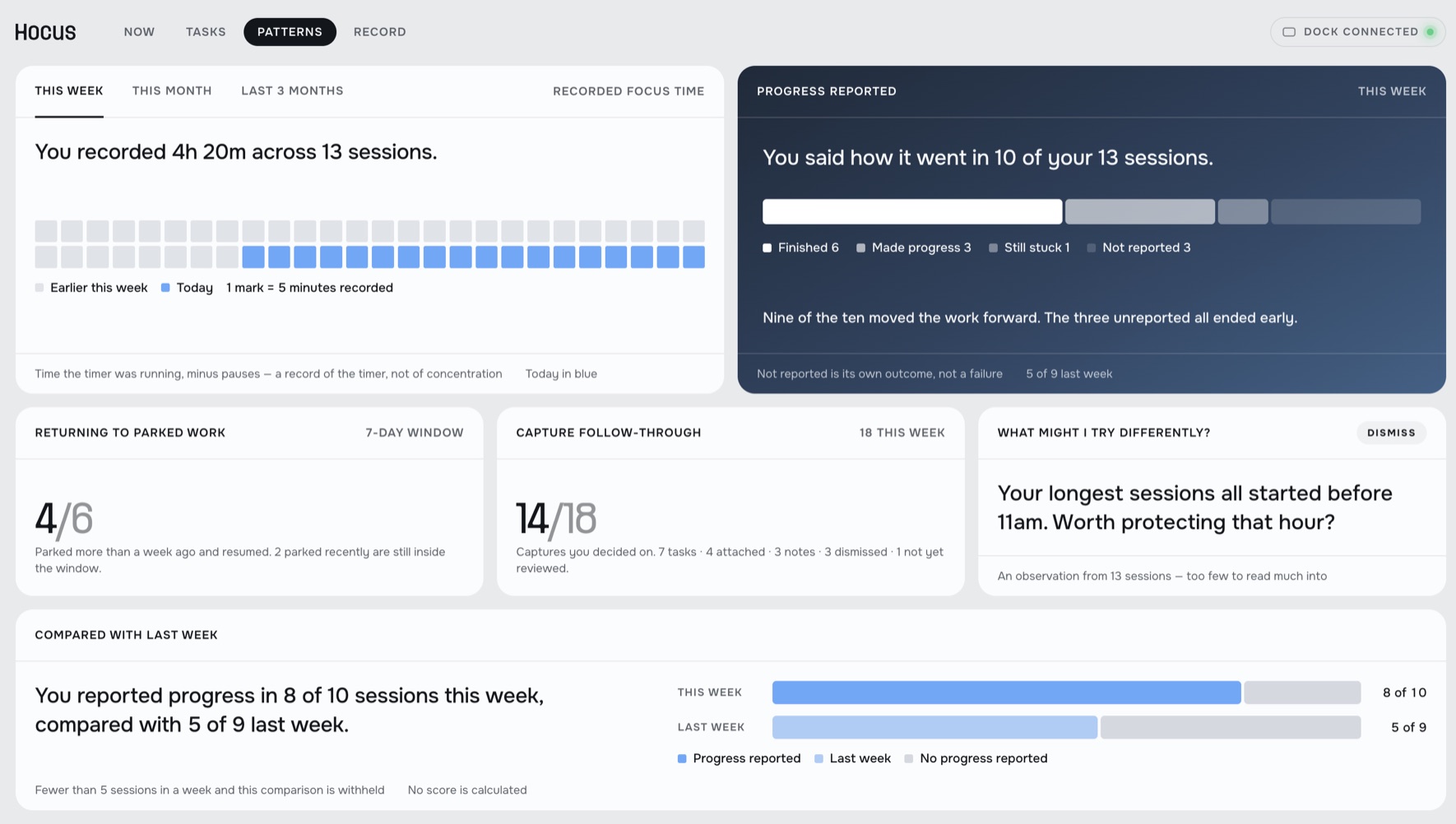
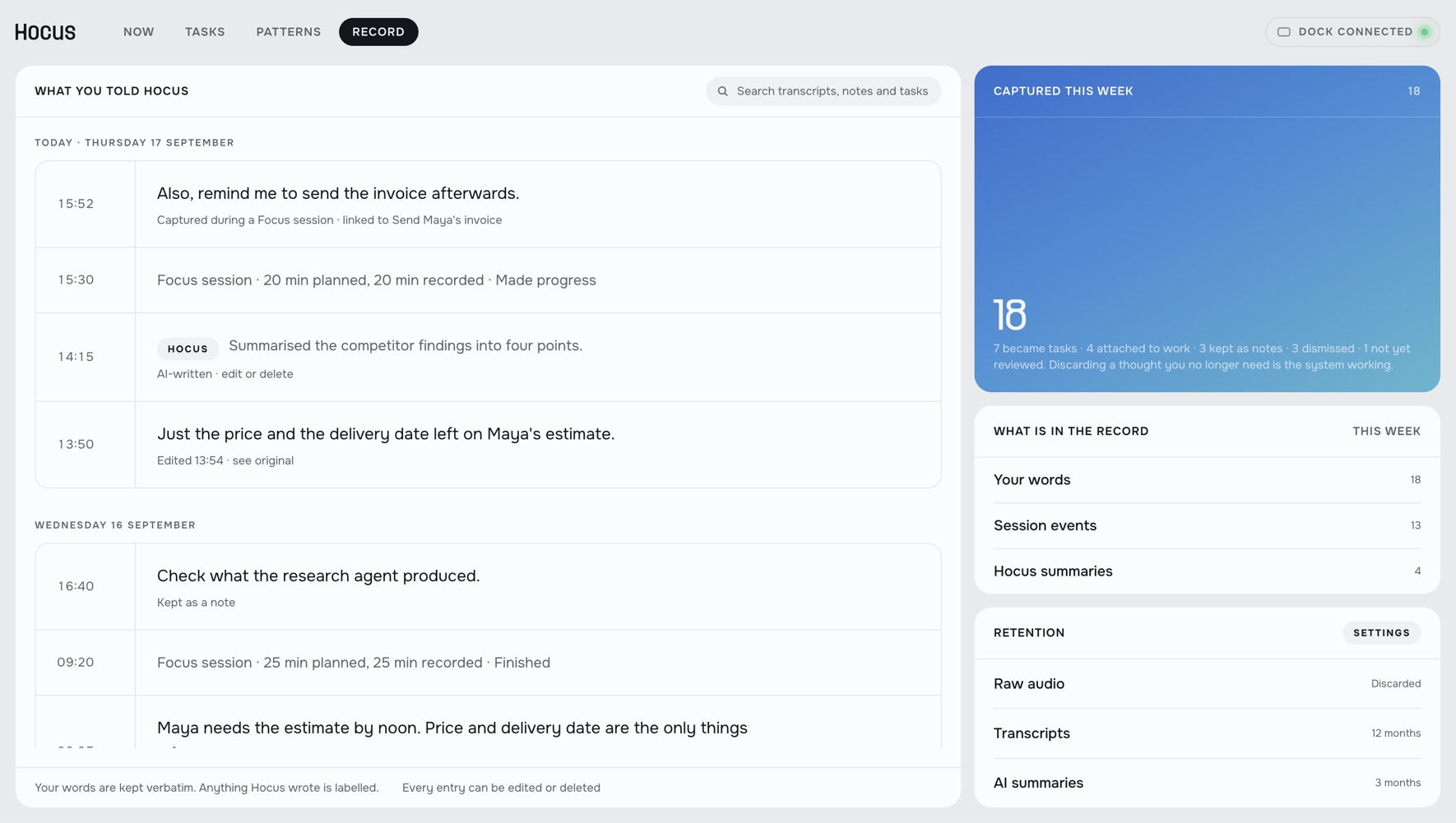
A desktop dashboard you do not need to keep open, in four parts: what is happening now, the tasks, the patterns behind them and what was said.
How I’d test this
The test shows what the dock brings to a working day: starting with a turn of the dial, keeping the next step in view and returning to work without searching for it.
- Set-up
- The dock beside the same guidance and timer in a desktop window.
- People
- Freelancers working on their own tasks, not a script.
- Length
- One week, so the measures reflect daily use, not first impressions.
SuccessFaster starts, sessions held to the end and quicker returns with the dock than with the window.
Reflection
Making an object was harder than designing screens. Getting one dial to feel right took the longest, and it was the part I enjoyed most.
- Holding the whole systemA dock, an app and a mark had to keep one tone. Screens never asked that of me.
- Thinking like the ownerI weighed cost, price and whether anyone would keep it on the desk.
- Deciding who decidesBetween the object, the model and the person, the person gets the final say.
Parallel work. One next step.